Style guide
Typography, color, and component standards for GuerillaType. The single source of truth for the look and feel.
Typography
Three families, each with a distinct job. Loaded once, used everywhere.
| Role | Family | Where | Why |
|---|---|---|---|
| Display | Lora (serif) | Headlines, hero titles, results-card numbers, blockquotes | Warm, readable serif with a clean italic. Replaces Fraunces (whose italic "f" was too curly for my subtext). |
| Body | Inter (sans) | All running text, buttons, navigation | Designed for screens, neutral, holds up at all sizes. |
| Mono | JetBrains Mono | The typing surface, tokens, kbd, table-style stats | Even-width characters so columns line up; ligatures off for honest character counting. |
Type scale
Fluid clamp() from small phones to wide desktops. No magic numbers in templates — only token names.
| Token | Range | Use |
|---|---|---|
--fs-200 | 13–14.4 px | Eyebrow, captions, mono labels |
--fs-300 | 14.4–16 px | Body |
--fs-400 | 16–18 px | Lede paragraphs, large body |
--fs-500 | 18–22 px | Subheads, h3, sidecard quotes |
--fs-600 | 24–32 px | Section h2 |
--fs-700 | 32–46 px | Big stat numbers, page titles |
--fs-800 | 42–64 px | Article h1 |
--fs-display | 48–88 px | Hero .h-display |
--fs-typing | 22–33 px | The typing surface itself |
Hierarchy rules
- h1 sits flush with no top margin (page heads style it).
- h2 has a top hairline rule on long-form articles, generous breathing room.
- h3 has half the top space of h2.
- Adjacent-sibling overrides eliminate double-spacing when an h2 immediately precedes a paragraph or list.
Color
Two themes, both warm. Dark default; light is paper-cream.
Dark theme (default)
| Token | Hex | Use |
|---|---|---|
--bg-0 | #14161e | Page background |
--bg-1 | #1c1f29 | Cards, sticky chrome |
--bg-2 | #252836 | Hover states, inputs |
--fg-0 | #ece6d6 | Primary text (warm fog) |
--fg-1 | #c9c2b1 | Secondary text |
--fg-2 | #8a8678 | Muted, captions |
--rule | #2d3040 | Borders, hairlines |
--accent | #e58060 | Persimmon coral — caret, links, highlight |
--accent-deep | #c1413c | Hover, deeper accents |
--secondary | #6ba9b3 | Teal — secondary buttons, alt highlights |
--good | #8fbf90 | Clean keys on heatmap, success |
--bad | #d76050 | Incorrect keystrokes, slow keys |
Light theme
| Token | Hex | Use |
|---|---|---|
--bg-0 | #f4ecdb | Warm paper background |
--bg-1 | #ebe2cd | Cards |
--fg-0 | #1c1d22 | Deep ink |
--accent | #c1413c | Typewriter-ribbon red |
--secondary | #1f3d4a | Deep ocean teal |
Spacing
Eight steps, geometrically progressive. Used for margins, padding, and gaps.
--space-1 (4 px) · --space-2 (8) · --space-3 (12) · --space-4 (16) · --space-5 (24) · --space-6 (32) · --space-7 (40) · --space-8 (48) · --space-10 (72) · --space-12 (104).
Radius
--radius: 2 px is the default — soft hairline edges. The typing surface itself stays at 0 for pixel-perfect span alignment. --radius-lg: 4 px for large cards. --radius-pill: 999 px reserved for status chips.
Breakpoints
Seven canonical stops. No ad-hoc values. New responsive rules MUST snap to one of these.
360 (small phone) · 480 (large phone) · 640 (phone landscape) · 768 (tablet portrait) · 1024 (tablet landscape) · 1180 (standard desktop) · 1280 (--max-width).
Components
Every interactive element renders at ≥ 44 × 44 px (WCAG 2.2 AA). Visible focus rings on every focusable element. Hairline 1 px borders, never thicker. Animations under 250 ms; motion respects prefers-reduced-motion.
Buttons
.btn— neutral, hairline border..btn--primary— filled persimmon, white text..btn--secondary— teal-bordered, fills on hover..btn--ghost— visible hairline border, transparent fill, brightens to accent on hover..btn--danger— filled with the bad-state color; reserved for destructive confirms in the styled modal system..btn--big— larger padding for hero CTAs..btn--small— compact, for in-card actions.
Modals
Native <dialog> element, never custom overlay divs. The .info-modal chrome is shared by:
- The site-wide info modal (
window.openInfoModal('home' | 'practice')). - Confirm + prompt replacements built by
util/modal.js— theconfirmModal({ title, message, confirmLabel, danger })helper returns a Promise; promptModal({ title, label, initial })returns Promise<string|null>. Both auto-focus the cancel button on destructive actions so a stray Enter doesn't fire. - The "Add to collection" picker on /quotes/.
Native confirm() and prompt() calls are banned site-wide.
Em-dash and quotes — never
Typeable content (corpus, UI strings, blog posts, lesson descriptions) uses -- instead of —, straight quotes (", ') instead of curly, and ... instead of …. The book ingest pipeline applies this normalization automatically. See the decision post.
Eyebrows
Mono caps, persimmon, with a 1.2 rem leading rule. Used to introduce hero titles and article heads.
Editorial divider (.rule)
Two flex-grow hairlines flanking a mono-caps label. Used to break long pages into named sections without the heaviness of an h2.
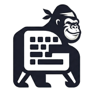
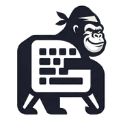
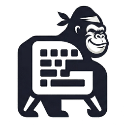
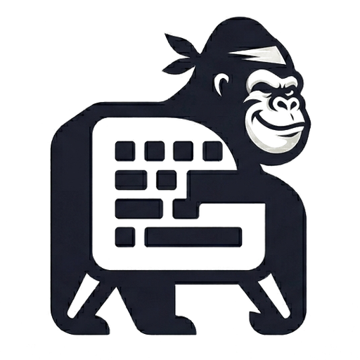
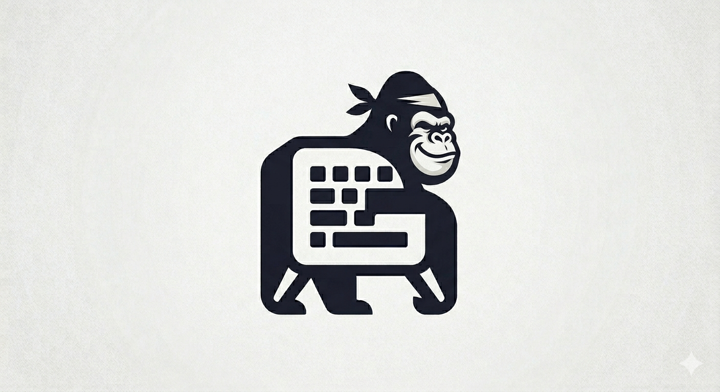
Brand mark + favicon
The brand is a stylized gorilla holding a keyboard. The same figure appears in three places: the favicon (browser tab), the header mark (next to the wordmark), and the footer mark (above the wordmark).
Variants
Two color variants, theme-conditional:
- Dark figure -- used in light theme. Dark navy on whatever the page background is.
- Light figure -- used in dark theme. Warm off-white (
rgb(236, 237, 239)), readable on the dark navy--bg-0.
Both variants share the same outline; only the fill changes. The light version is generated programmatically from the dark source by recolouring every non-transparent pixel.
Sizes shipped
Every PNG is square and centered around the figure with a small amount of breathing room.
| File | Size | Used for |
|---|---|---|
favicon-16.png | 16×16 | Browser tab fallback |
favicon-32.png | 32×32 | Browser tab (modern) |
favicon-48.png | 48×48 | Windows shortcut, browser cache |
favicon-64.png | 64×64 | High-DPI tab, retina header |
apple-touch-icon.png | 180×180 | iOS home screen |
icon-192.png | 192×192 | PWA install (Android), header <img> source |
icon-256.png | 256×256 | High-DPI PWA tile |
icon-512.png | 512×512 | PWA splash, share-card avatar |
Each size also has a -light sibling: favicon-32-light.png, icon-192-light.png, etc.
Downloads
- favicon-32.png / favicon-32-light.png
- favicon-48.png / favicon-48-light.png
- favicon-64.png / favicon-64-light.png
- apple-touch-icon.png / apple-touch-icon-light.png
- icon-192.png / icon-192-light.png
- icon-256.png / icon-256-light.png
- icon-512.png / icon-512-light.png
- Source 1408×768 PNG (full master, transparent off-white background)
Wiring
The browser tab favicon ships as paired <link rel="icon" media="(prefers-color-scheme: …)"> tags so OS-level dark/light preference picks the right variant. The header and footer brand marks use a CSS background-image keyed off [data-theme], which is the attribute the manual day/night toggle controls -- so user preference (not just OS) is respected:
.site-brand__mark {
  background-image: url("/assets/img/icon-192.png");
}
[data-theme="dark"] .site-brand__mark {
  background-image: url("/assets/img/icon-192-light.png");
}
Regenerating the icon set
The PNGs are generated by a one-off Node script that uses sharp (already a dependency via @11ty/eleventy-img). To rebuild after changing the source GuerillaType Favicon.png, run the same pipeline: center-crop to 540×540, knock the off-white background to transparent (channel threshold ≥ 230 → alpha 0, soft-edge band 195-230 → proportional alpha), then resize to each target size for both dark and light variants.
Accessibility standards
- WCAG 2.2 AA contrast across all themes (4.5:1 for body text, 3:1 for large text).
- 44 × 44 px minimum touch targets, enforced via a base rule with opt-out flag.
- Skip link to
#main. - Native
<details>/<dialog>for collapsibles and modals. aria-current="page"on active nav links.- Live regions on results, toasts, live stats.
prefers-reduced-motionrespected globally.- Keyboard-shortcut overlay covers every interaction (press
?).